Engaging content design for growing young readers
Brand: Brightly / Penguin Random House
Role: Art Direction + UX/UI + Visual Design
ReadBrightly.com is a Webby-nominated content marketing site that provides tools for parents, educators, and caregivers to keep kids engaged with books at every age and stage of life.
I worked with stakeholders, marketers, and content creators to lead visual design, extend branding, and enhance the site experience through continuous user research and testing.
3M page views per month
Website Milestones:
216.3% ↑
CR increase
with retail
4.1 units per order


Articles
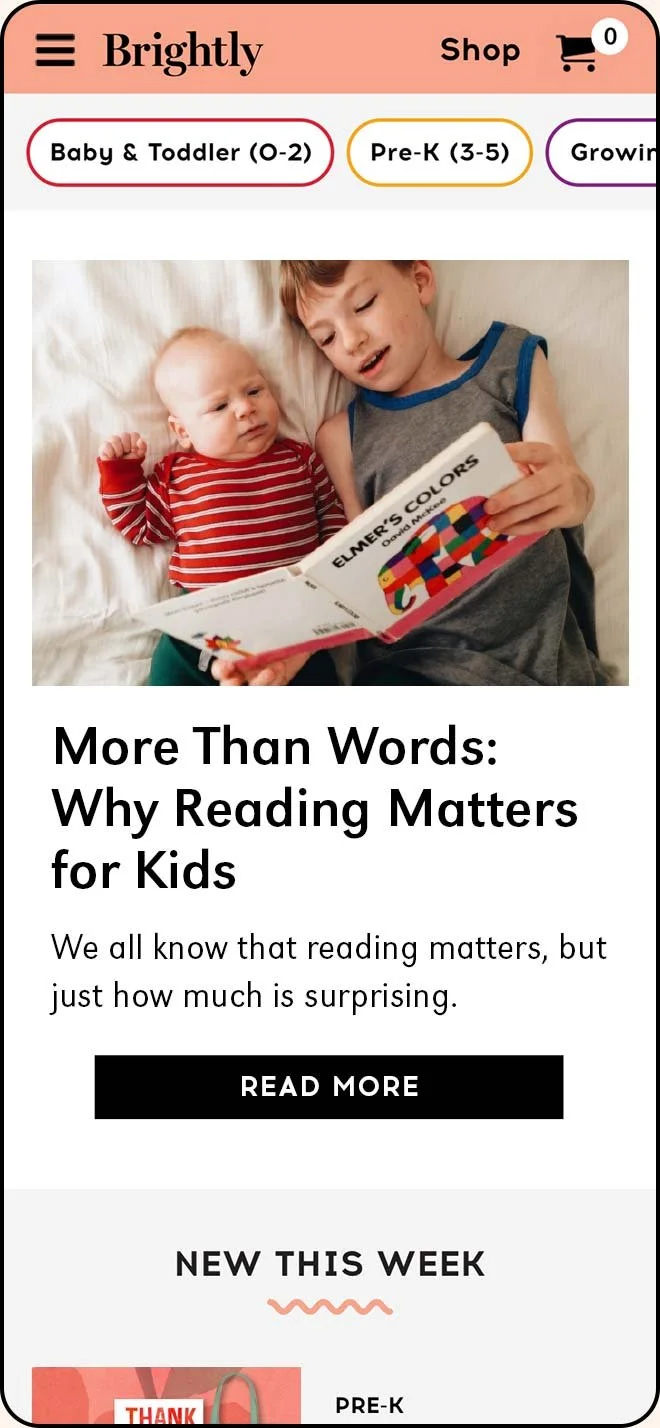
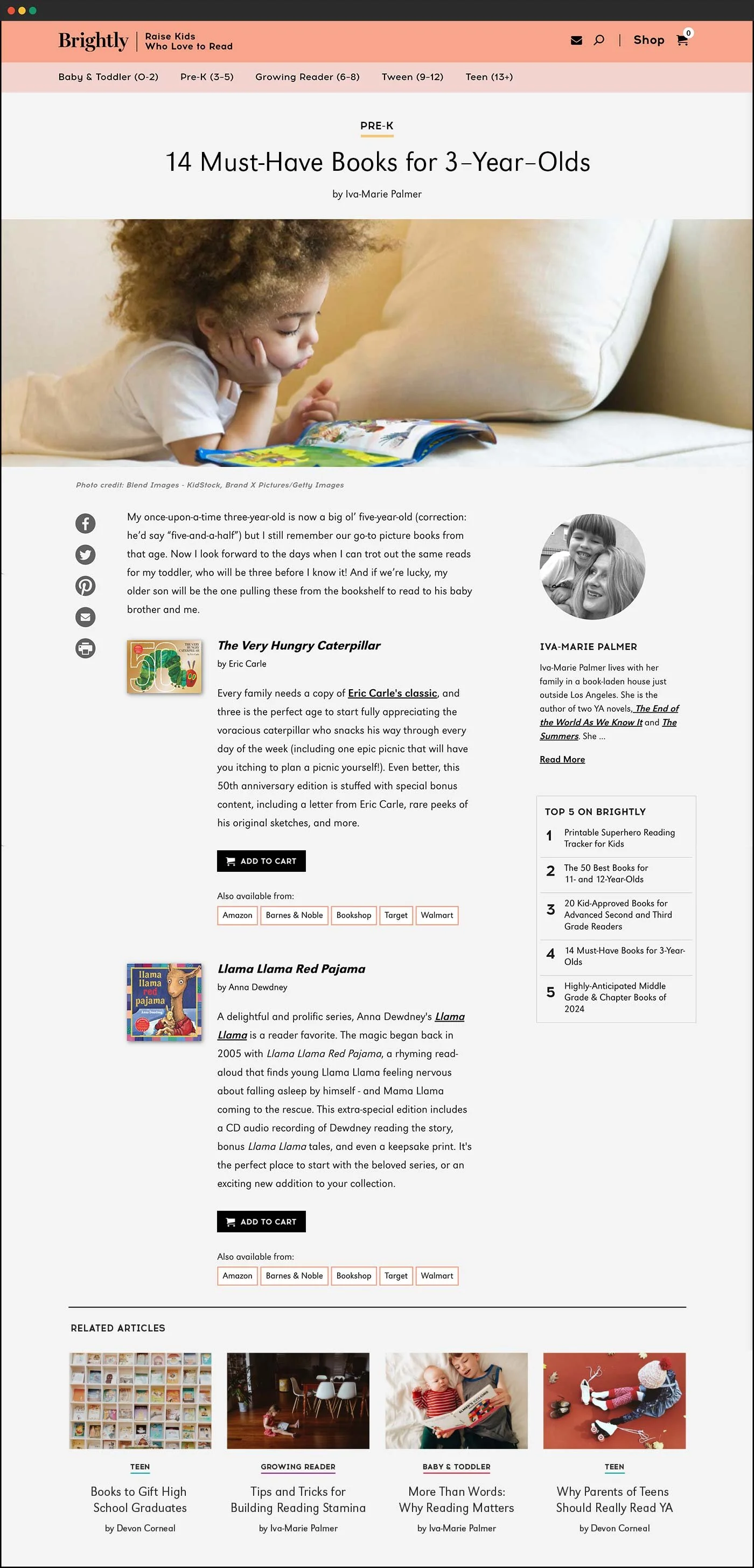
Brightly's article template is designed to showcase a variety of content types.
On average, 63% of visitors arrive at an article page through organic search. I designed a modular template that enables editors to organize and optimize content based on SEO, increasing user engagement.
-
Early Wireframe (All Modules)

-
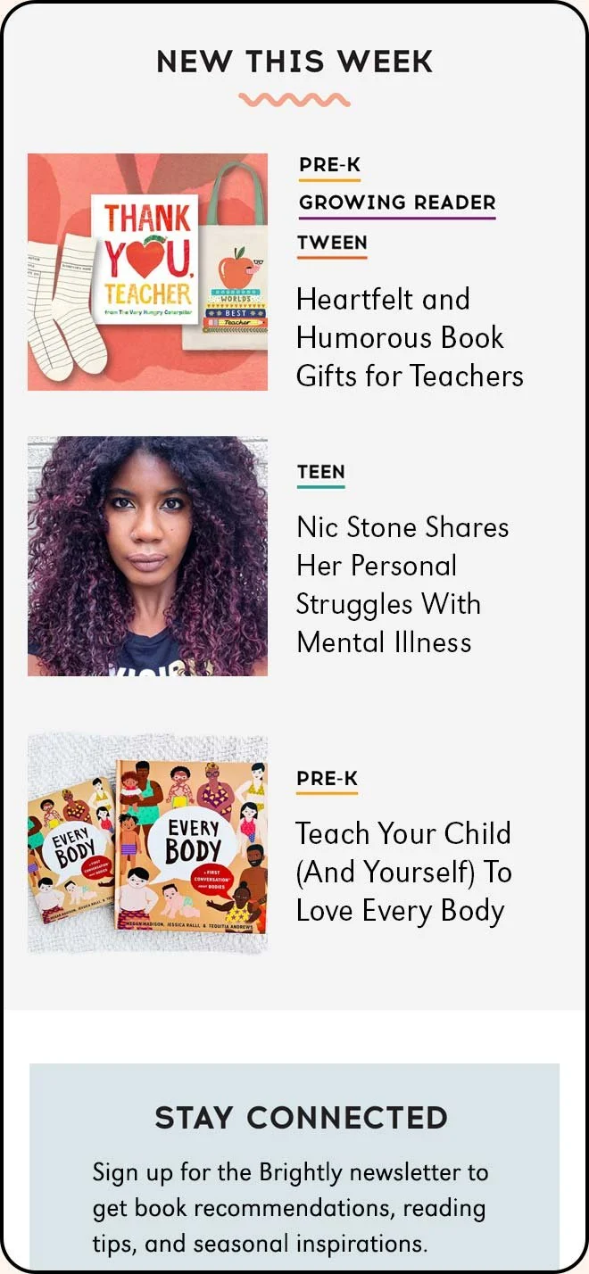
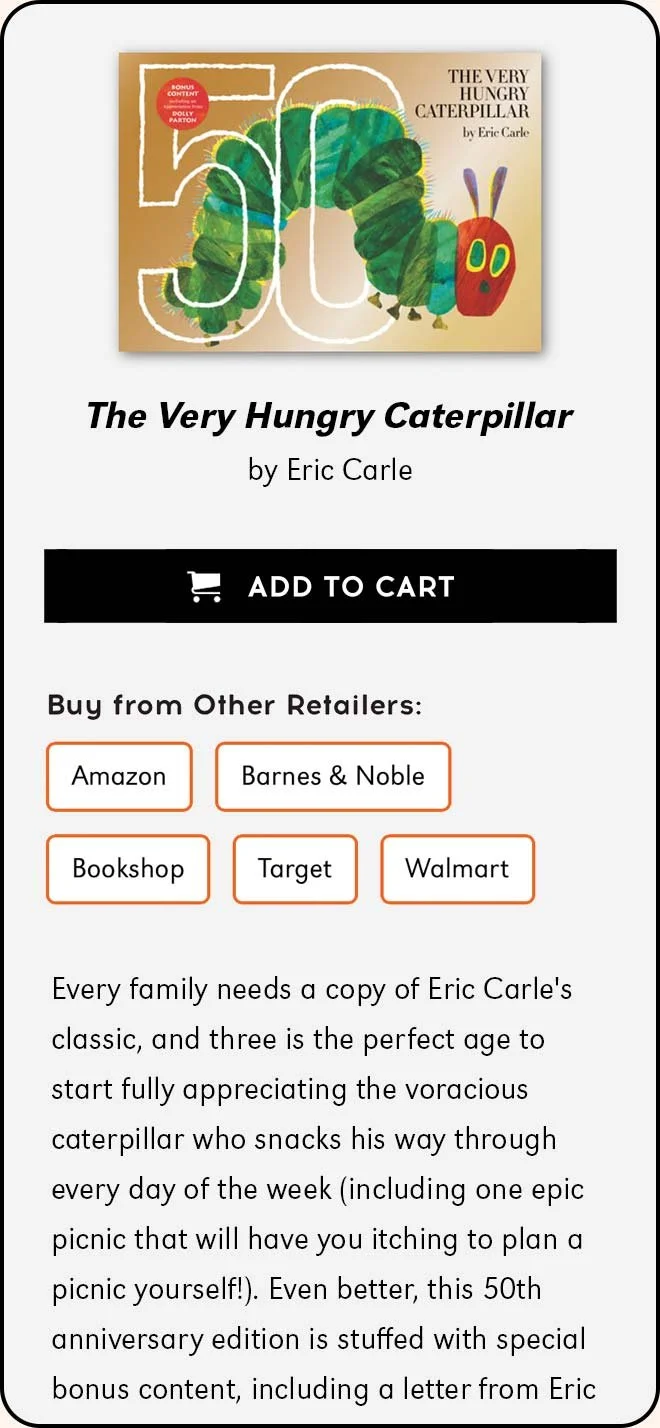
Book Recs + Retail + Recirculation
-
Shareable Content

-
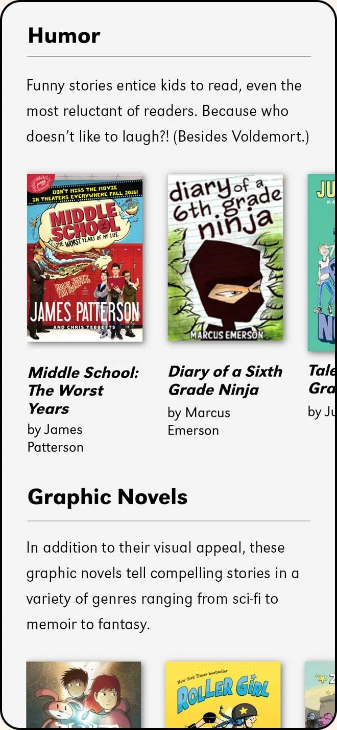
Video + Book Galleries

-
Mobile – Article

-
Mobile – Book Module
-
Mobile - Book Gallery
Design System
All content is branded with a colorful design system…
Each color palette is specific to an age/stage and provides a wayfinding format for locating content that is relevant to the audience.

…and features commissioned photography, illustration, and bespoke art.
I collaborated with amazing contributors to bring the brand's artistic vision, tone, and voice to life—shoutouts to Seana Williamson (photography) and Penelope Dullaghan (illustration).

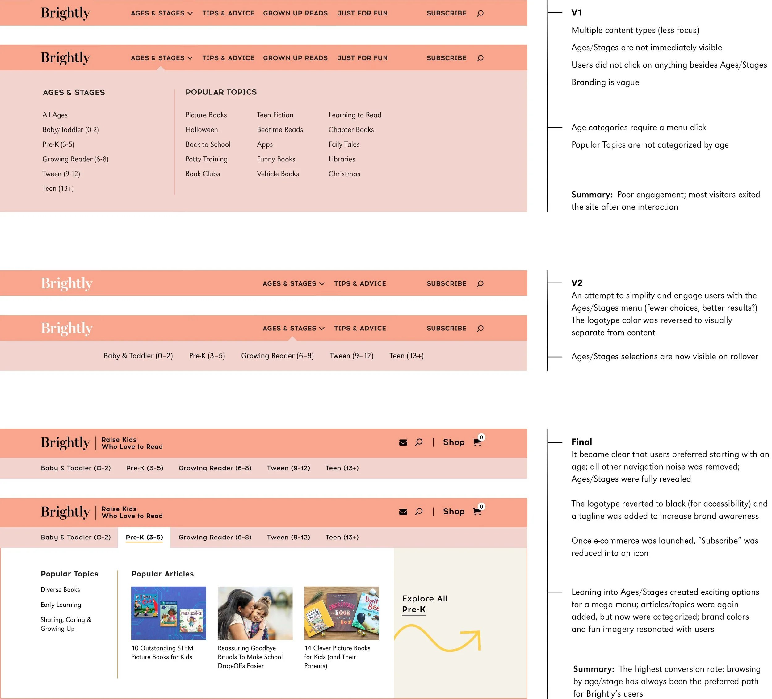
Navigation
Brightly’s navigation evolved to meet user needs.
Over time, analytics informed the information architecture, enabling me to tailor the interface design for browsing content by a child’s age and stage.
-
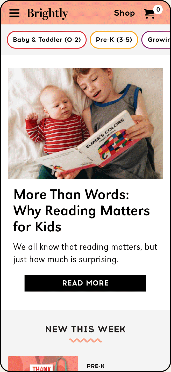
Mobile – V1
Although hamburger menus are standard, users did not engage, potentially due to the slim, inaccessible design of the first nav.

-
Mobile – V2
Exposing navigation improved engagement but did not show the range of Brightly’s content; Tips & Advice had low click rates.

-
Mobile – Final
The hamburger menu returns and ages are exposed in a WCAG AA-accessible format; robust drawers feature curated content.
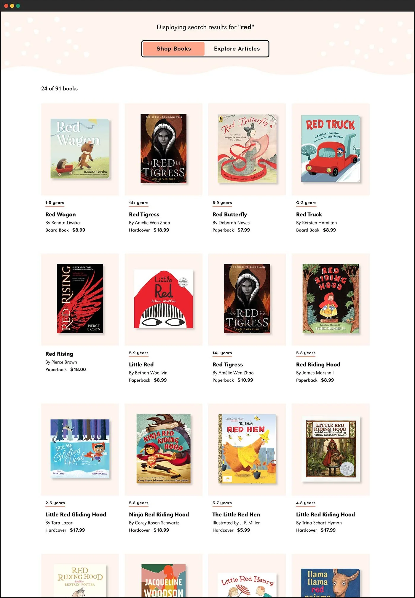
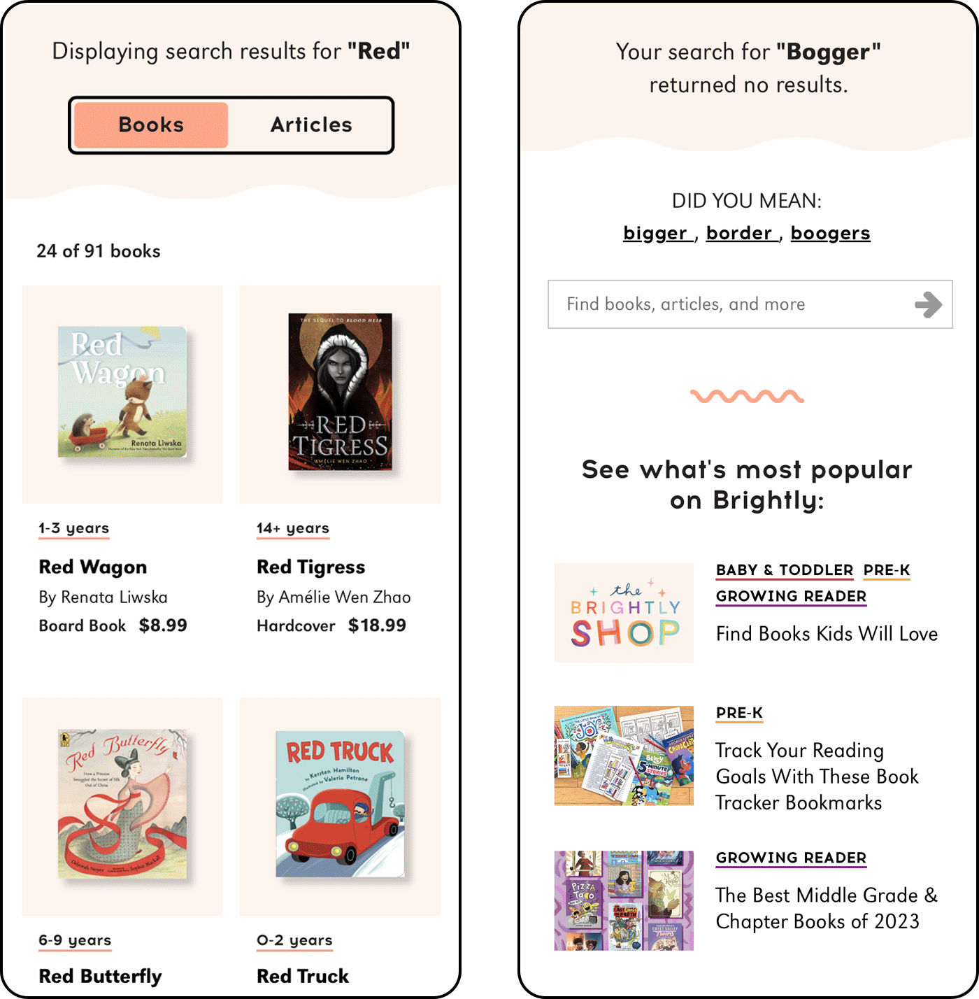
Site Search
Enhanced search functionality allows visitors to toggle results between books and articles.
By surfacing product (books) in Brightly’s search results, the average retail click rate increased to 20.5%.
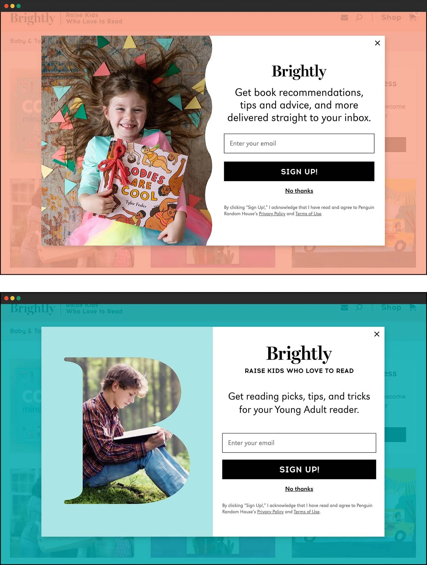
Email Acquisition
And let’s not forget the subscribers!
Contextual takeovers make it easy for Brightly users to subscribe to newsletters and receive content relevant to their lives. Each type of email capture aligns with user behavior, and the art is customizable within WordPress to ensure a consistent UX with Brightly’s branding.
These designs resulted in a 50% CR increase!

Brightly’s audience is loyal + engaged!
Actual User Feedback
“I look at your website as a safe messenger promoting progressive values… the font choices, the graphics… it’s sweet, it’s warm, it’s embracing.”
Actual User Feedback