
How applying insights to existing user journeys met the needs of children’s book buyers and generated an annual revenue of $400k
Brand: The Brightly Shop / Penguin Random House
Role: UX/UI + Visual Design
Illustrations: Penelope Dullahan
Summary
Initially a microsite exploration for digital marketers who wished to create bespoke storefronts for children’s books at Penguin Random House. The project grew in scope as users’ needs were uncovered. It became clear that Brightly had the potential to expand from a content marketing site into a robust book-discovery platform.

Disclaimer: Skip all this and see the final design instead. 🙂
Is Brightly potentially underserving most of its audience?
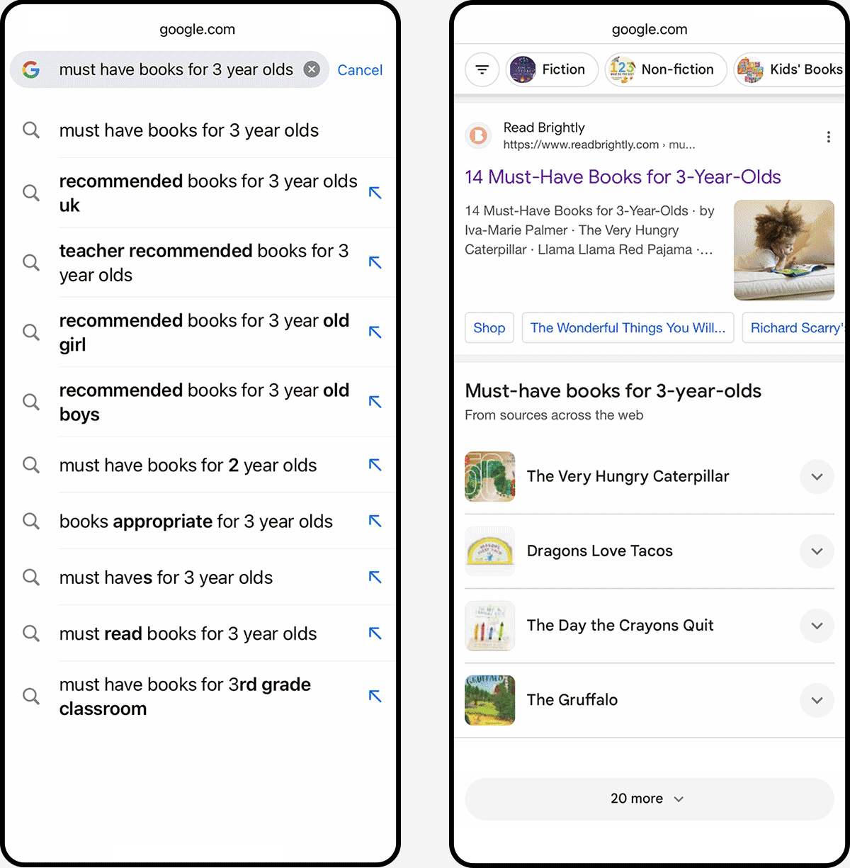
Traffic source analysis showed 63% of Brightly’s audience enters an article page through search
Search visitors had the 2nd highest retail click rate and the lowest return visitor rate
Those visitors are primed to purchase, yet 95% leave without clicking a retail link, and most never return
Devices: 53% mobile, 47% desktop
Retail Click Rate: 6.3% (email = 6.8%)
Mobile visitors have a slightly higher RCR across all devices and channels
Article Page – Pain Points
-
Items 1, 3, 4
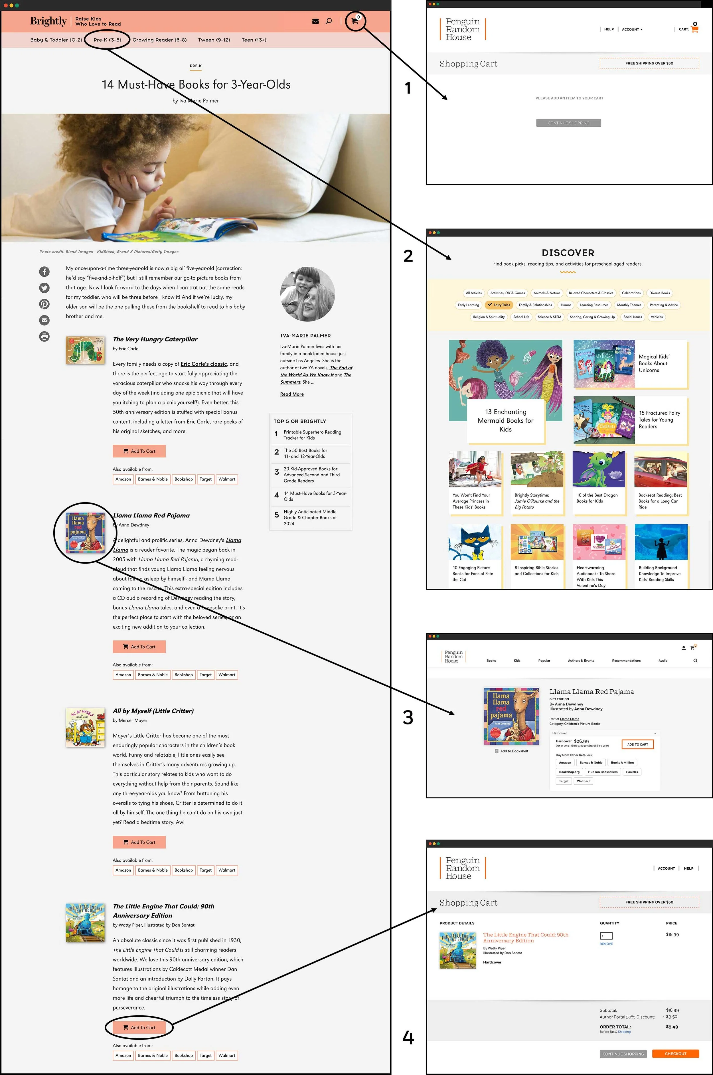
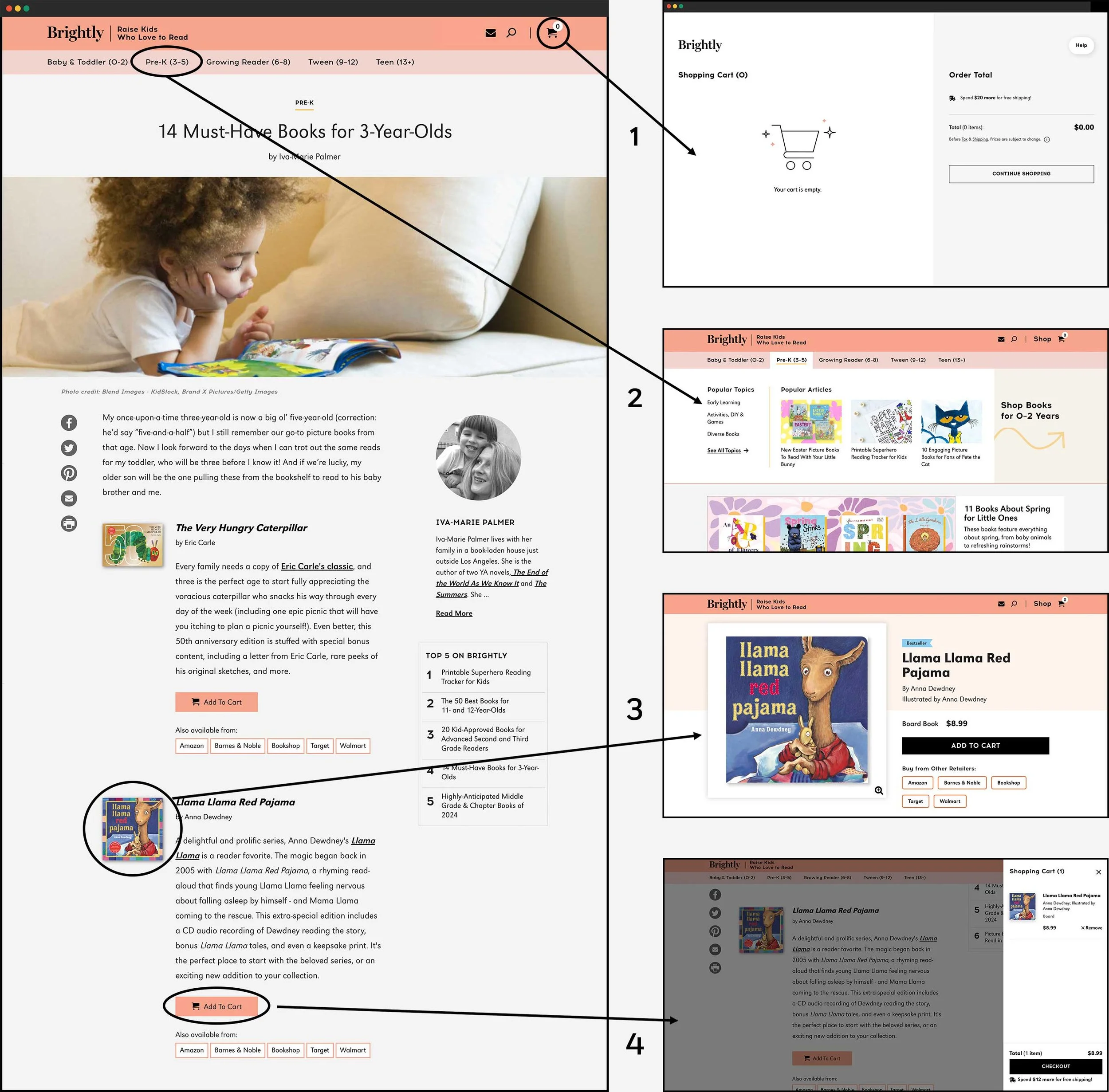
The handoff between Brightly and Penguin Random House is confusing and unexpected. Brightly’s nav includes a (1) cart icon referencing the PRH checkout process. Brightly book covers/titles (3) link to PRH.com product detail pages. Users who (4) added a book to their cart on Brightly were taken to a PRH checkout experience and could not navigate back to Brightly, leaving them dead-ended.
-
Item 2
Users naturally gravitated towards and engaged with Brightly’s navigation to find more books but were not always satisfied with the path it offered, either because they wanted to see more books, not articles, or because the category pages weren’t clear/didn’t allow them to filter by age. Four out of five users on mobile missed the article filters entirely.
User Interview
“I don’t really have time to go through blog posts, that’s not what I’m looking for. I’m looking for a book, so I’m looking for filters, I’m looking for some type of tool that lets me narrow down books for this age group, not blog posts.”
User Interview
“I wish I could see some book previews, like the first couple of pages, to see if it's something that fits the personality of the child I'm buying for, if I'm not familiar with the book.”
Hypothesis
Occasional book gifters coming to Brightly from search will be more receptive to an experience that allows them to filter books, get curated recommendations, and make purchasing easy. These users would value and return to a user-friendly experience which can drive engagement and sales.
-
Give users the ability to browse, filter, and purchase books in meaningful ways that match their needs.
-
Give editors and imprints the ability to curate collections of books outside of an editorial context.
-
Provide a pathway for discovery that serves consumers who typically look for gifts and are pressed for time.
Adding value to the existing UI with minimal effort.
-
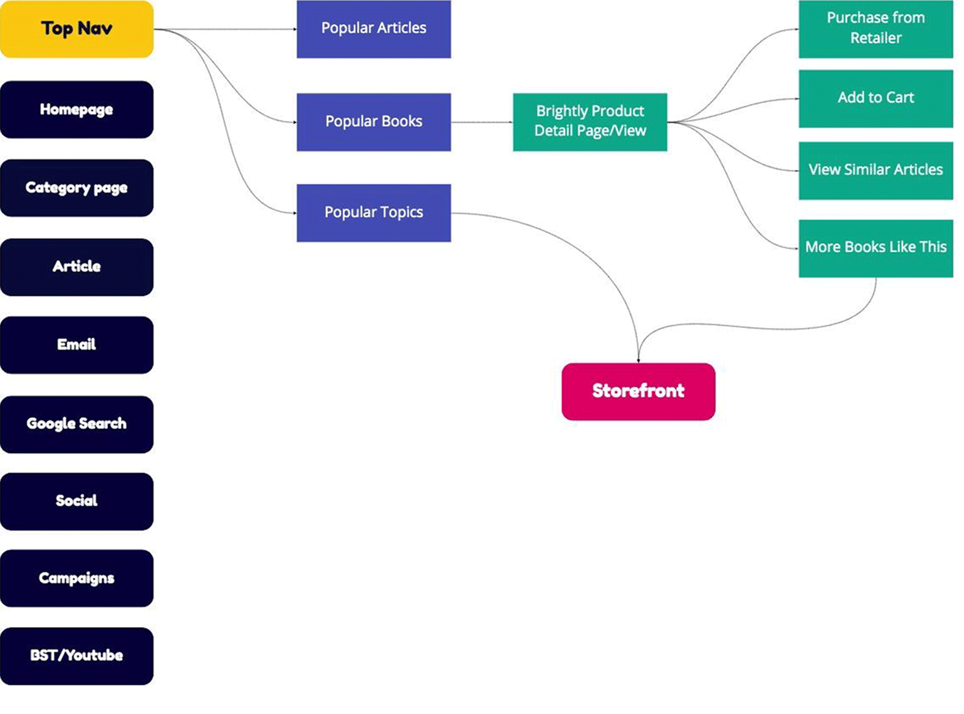
User Journey – Top Nav
A more robust mega menu navigation for each age/stage will allow users to connect directly with book detail pages, topics, and the shop’s landing page.
-
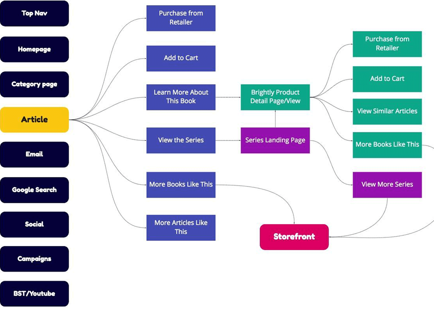
User Journey – Article Page
Without implementing a full template redesign, existing CTAs that take users to the PRH site can be redirected to the Brightly storefront.
-
New Designs
To meet the MVP requirements, only three new designs were needed to test the value proposition of the storefront.
Design Exploration
-
Shop Navigation
Mobile ranked highest, so I experimented with the existing horizontal “pill” nav. It was confusing as articles and books had layered (1a) options, and a standalone Shop “pill” (1b) proved redundant once landing page filters were visible.
Isolating the Shop CTA into the site nav (2a) optimized discoverability and low LOE. It declutters the hero area and allows users to lean into the hamburger for other sitewide navigation. I also explored a textual dropdown for age/topic selection. Desktop was more straightforward as a mega menu offered numerous opportunities.

-
Shop Landing Page
Meant to present curated collections to drive discovery, we also wanted to allow users to browse an age range of seasonal book selections.
For mobile, I followed collection patterns, including stacking (1), carousels (2), and bento box grids (3). I wanted to present the most product within the smallest footprint (4) while maintaining a clean interface.
Desktop offered UI variations for exposing filters and multiple collections without disrupting the browsing experience, all while keeping users on one page.

-
Age/Stage Landing Page
Variations on a theme. After creating the textual dropdown (1) while rethinking mobile navigation, I explored other lockups for filtering by age/topic. Some were awkward and unfamiliar patterns (2). Ultimately, a single button (3) for an age/topic overlay (4) was the cleanest approach.
For desktop, a second design was created for topic filters in the left rail.
Tuning the Design
-
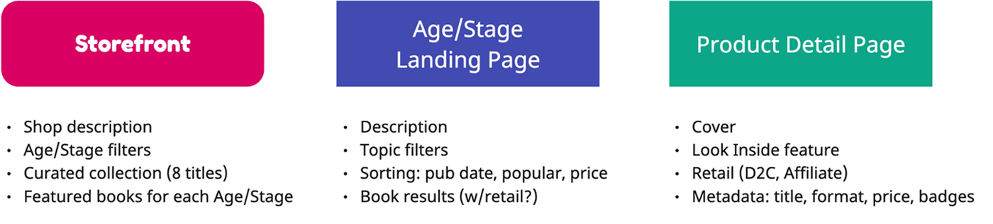
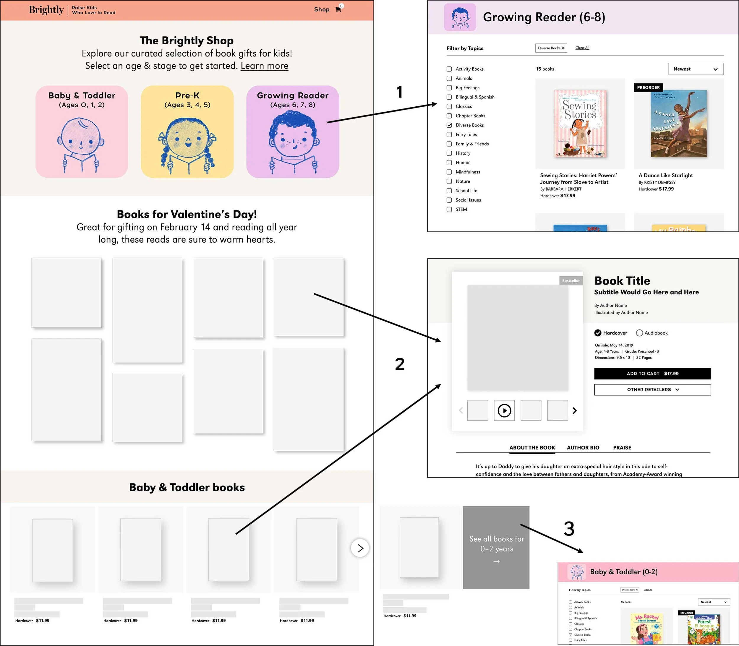
1. Shop Header
A placeholder for messaging indicates Brightly’s value proposition. Users select an age/stage to browse and filter by multiple topics. Initial sketches for branding were also explored.
-
2. Curated Collection
For MVP, one curated collection is featured. Book covers link to product detail pages; PDPs are accessible wherever a title is shown, in both the shop environment and articles.
-
3. Book Carousels
Seasonal book selections will be promoted for each age/stage. To encourage discovery, the last card CTA invites users to see all book results for that age range on a new page.
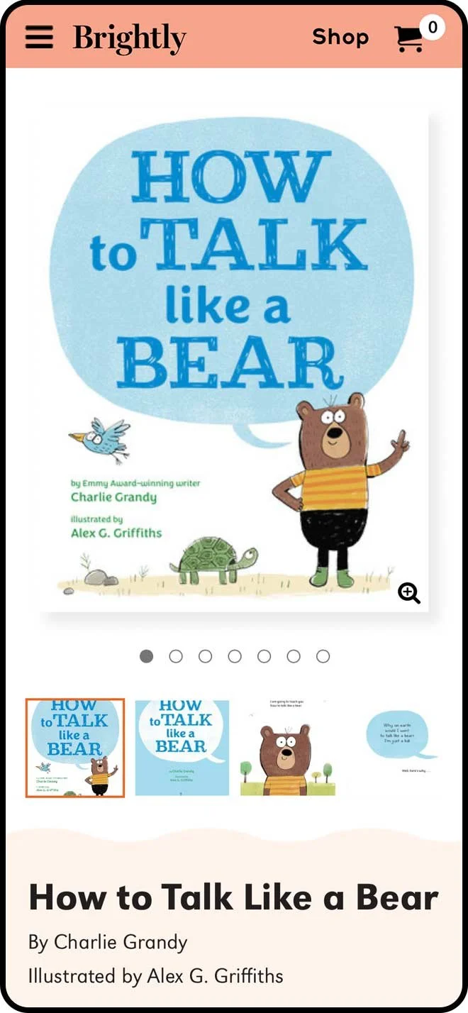
On-Brand PDPs
-
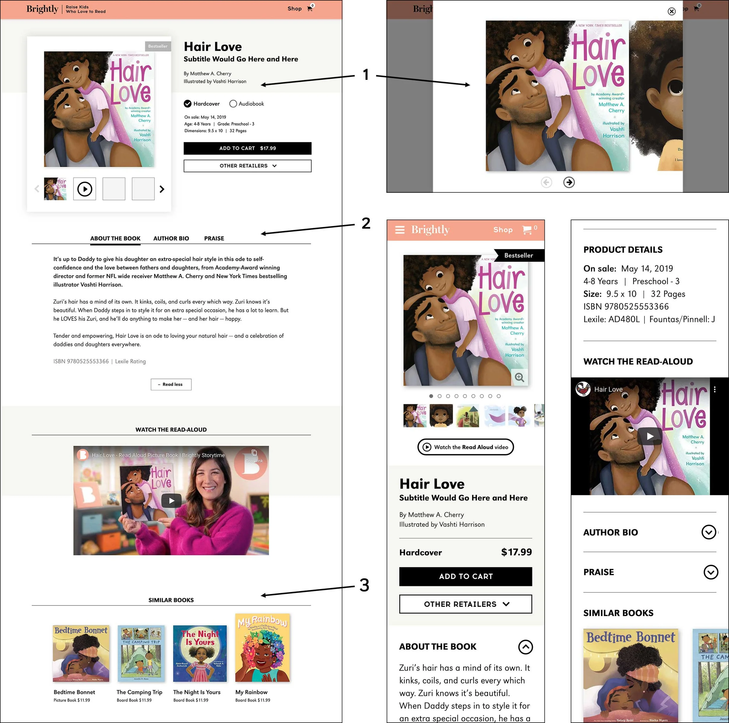
1. Key Info + Look Inside
A quick way to skim with an easy path to purchase. “Look Inside” previews maximize viewports to showcase interiors and videos.
-
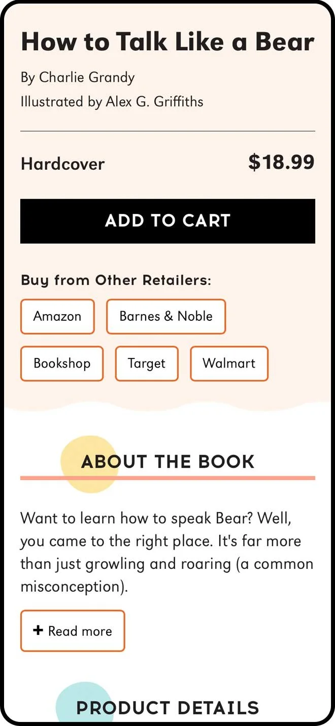
2. Product Details
Prioritizing data that book buyers value, including description, author and illustrator bios, reviews, and Lexile rating.
-
3. Recirculation
Utilizing book data points within the API, “Similar Books” offers extra pathways for product recommendations and discovery.
Solving Those Pain Points…
-
Item 1
Cart confusion was corrected by brand awareness. Clicking the Brightly logo in the upper left returned users to their last interaction.
-
Item 2
The mega menu allowed users to see topics and not just articles. A large CTA was included, steering consumers to the Shop experience.
-
Item 3, 4
Clicking on a book cover leads users to a branded PDP and an “add to cart” button now triggers a mini cart drawer on an article page.
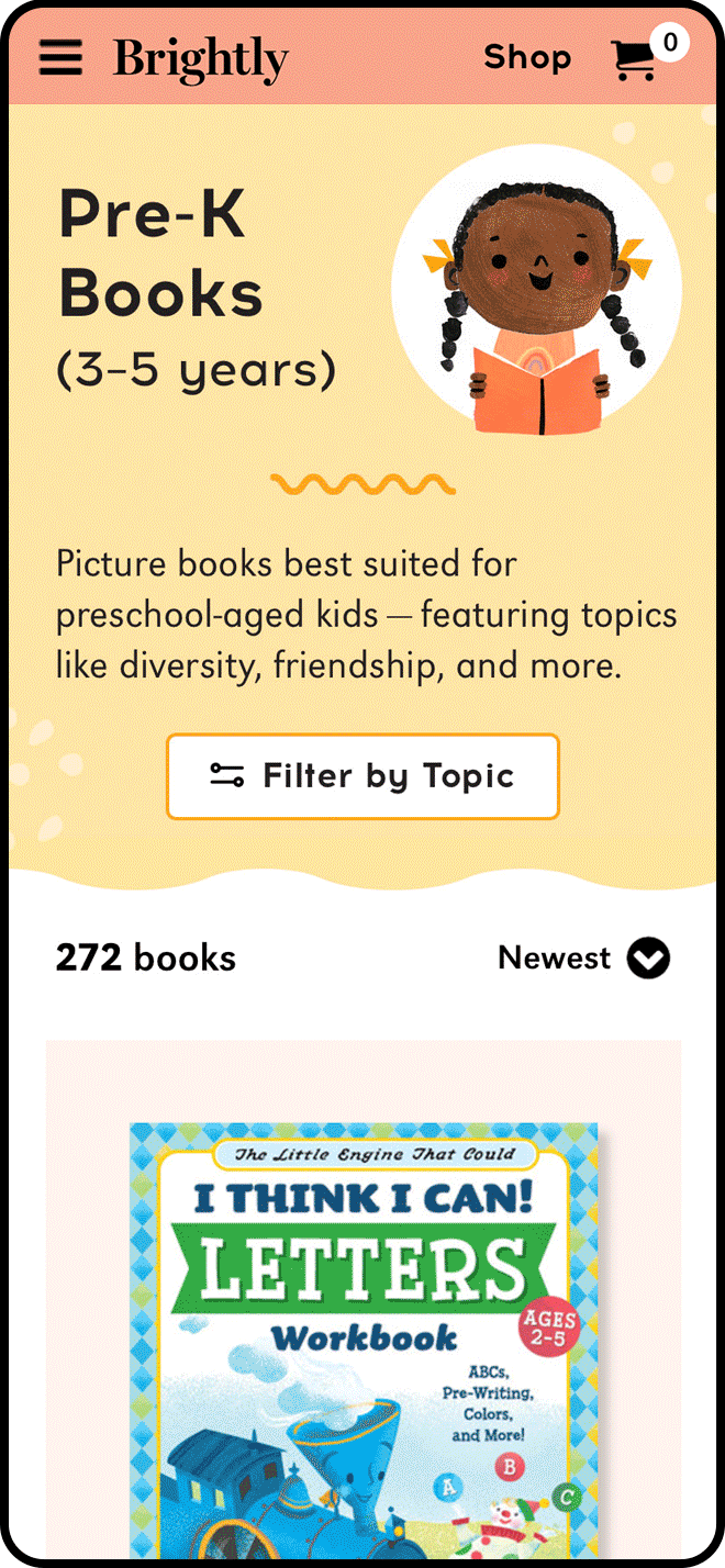
What Was Built – Shop Page
Key user actions:
Select an age/stage to start browsing
View the featured curated collection of books
Browse seasonal book carousels for specific ages/stages
What Was Built – Age/Stage Filtering
Key user actions:
Filter books by one or more topics
Sort books (Newest, Popular, Price)
Click on the quick add-to-cart button
Click on a book to view the product detail page
What Was Built – Product Detail Page
Key user actions:
View the “Look Inside” (book preview)
Click “Add to Cart” or “Pre-Order”
Click a retailer button
Click on “Similar Books”
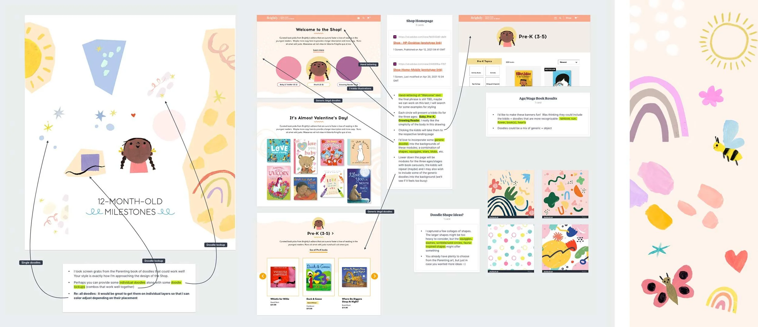
Branding
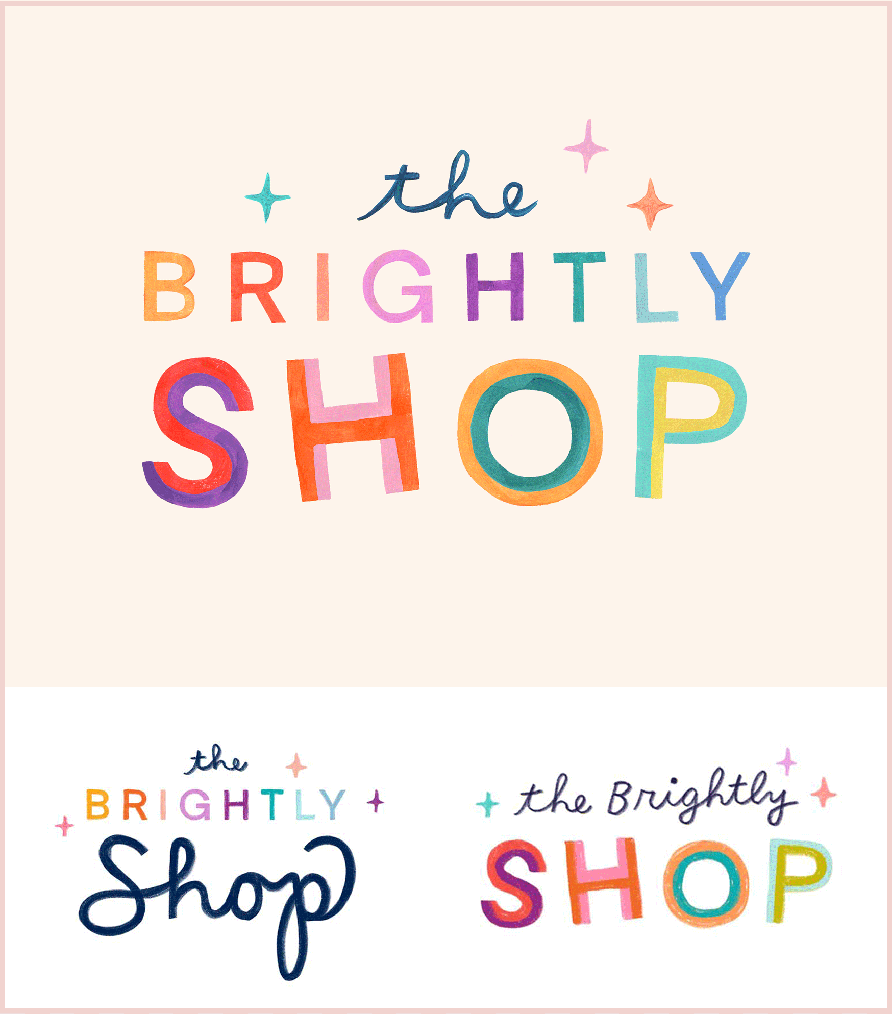
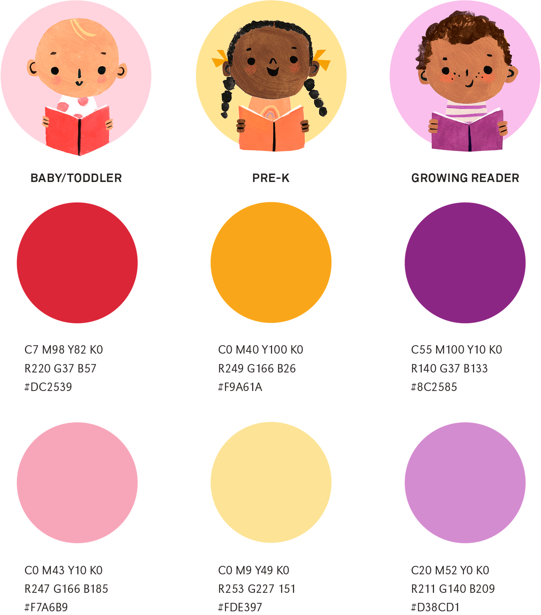
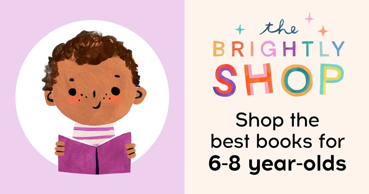
The Shop aesthetic is a joyful expression of reading through playful, hand-crafted illustrations and doodles. Working with illustrator Penelope Dullaghan and drawing inspiration from Brightly’s age-specific palette, a unique shopping experience was created that balances usability with delight.


What I Learned
It was incredibly valuable for product + design to partner together and get feedback directly from our users — even if it doesn’t result in radical changes or insights — to affirm our approach and add color and nuance to our target audience.
Brightly users access libraries to test drive books or new series and/or to get books they don’t want to invest in. There is potential to serve this need/capture more data around library users on Brightly via a “check availability from your local library” button.